
You might be wondering why your website isn’t performing the way you hoped. If your conversion rates are disappointing, you’re not alone, and I’m here to help! I’ve experienced the frustration of losing potential customers due to simple mistakes on my site. In this post, I’ll share practical tips to identify and fix the issues that could be hindering your success. Let’s dive in and transform your website into a conversion powerhouse!
Key Takeaways:
- Evaluate your website’s design and user experience – a clean, intuitive interface can significantly enhance user engagement and lead to higher conversion rates.
- Optimize loading speed and mobile responsiveness, as slow or non-mobile-friendly sites can drive potential customers away.
- Utilize clear calls to action and compelling content to guide visitors toward desired actions, making it easy for them to understand the next steps.
The Psychological Traps That Deter Customers
Psychological traps can subtly sabotage your website’s ability to convert visitors into customers. Factors like choice overload, social proof, and fear of missing out can distort a customer’s journey, leading to frustration and abandonment. If your website overwhelms users with too many options or lacks clear guidance, they may second-guess their decisions, resulting in lost sales. Identifying these traps is crucial for crafting an engaging experience that fosters conversions.
The Role of Cognitive Bias in Decision Making
Cognitive biases play a significant role in how users interpret information and make decisions on your website. For instance, the anchoring effect can skew perceptions of value if your pricing isn’t presented strategically. By showcasing the most expensive option first, you can influence how users perceive other prices offered, guiding them towards desired purchasing behavior.
Emotions Over Logic: Understanding User Behavior
Humans are inherently emotional beings, and this is often reflected in their online behavior. While logical reasoning is a part of decision-making, emotions frequently take precedence. If your website fails to evoke a positive emotional response, you risk losing potential customers, as they’ll search for connections elsewhere.
Engaging emotions, such as excitement or trust, can significantly enhance the user experience. For instance, storytelling can create relatability and draw users in, while warmth, humor, or empathetic messaging can foster a connection. I’ve seen websites that incorporate testimonials or success stories effectively boost conversions by appealing to emotions rather than just presenting cold, hard facts. Establishing that emotional bridge makes users more inclined to choose your service or product, turning potential interest into sales.
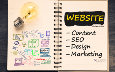
Identifying the Fatal Flaws in Your Design
Uncovering the design flaws that hinder conversions begins with a critical eye on user navigation and interface elements. Take a close look at your website’s layout, colors, and typography. All should work harmoniously to guide users seamlessly toward their goals. Analytics can reveal where users drop off or get frustrated, helping you pinpoint the areas that might need a makeover. Conducting user testing to gather real feedback can also highlight design shortcomings you might overlook. Focus on these aspects to create an inviting digital experience that encourages visitors to take action.
The Importance of User Experience (UX)
Positive user experience (UX) keeps visitors on your site longer and facilitates conversions. A seamless journey, with no unexpected hurdles or distractions, is key. Engaging designs combined with fast loading times ensure users find value without frustration. A website that understands its visitors’ needs typically results in higher engagement rates. Plus, incorporating personalization elements, like relevant recommendations or tailored content, can significantly elevate the user experience.
Key Elements of High-Converting Aesthetics
A high-converting website blends functional design with appealing aesthetics to create an unforgettable visitor experience. Effective use of whitespace allows for easy navigation, while a visually pleasing color palette can evoke emotional responses. Incorporating compelling visuals, well-placed call-to-action (CTA) buttons, and concise yet informative copy can drive user engagement. Using A/B testing to compare different design elements helps pinpoint what resonates best with your audience for maximum conversions.
Incorporating high-converting aesthetics involves a deep understanding of your target audience. Research shows that 94% of first impressions are design-related, so your website’s visual appeal is fundamental. Focusing on responsive design ensures it looks appealing across all devices, as mobile traffic continues to grow. I always recommend utilizing a grid layout to create visual harmony and improve content readability. Effective CTAs should stand out through contrasting colors yet maintain brand cohesion. Testing elements like button size or text can also lead to increased interactions, ultimately enhancing overall conversion rates.
Content That Connects: Engaging Your Audience
Engaging your audience starts with creating content that resonates on a personal level. Your words need to evoke emotions, address their pain points, and speak directly to their needs. By tapping into the desires and motivations of your target demographic, you’ll cultivate deeper connections that prompt action—from signing up for newsletters to making purchases. Making sure your content aligns with their expectations and interests will significantly enhance user experience and increase conversion rates.
Crafting Compelling Copy that Sells
Every word on your website should serve a purpose, driving visitors toward a clear action. Start by using persuasive language that highlights benefits rather than just features. Utilizing social proof, statistics, and storytelling elements can create urgency and foster trust. Phrases like “Join thousands of satisfied customers” evoke a collective experience, while clear calls to action guide users seamlessly toward the next step in their journey.
Visual Storytelling: Beyond Words
Visual storytelling transcends traditional text-based content, engaging the audience through imagery and design. High-quality visuals can simplify complex concepts, evoke emotions, and create a memorable user experience—important factors that can decisively influence conversions. Think about how infographics, videos, or illustrations can complement and amplify your brand’s message, making it both more relatable and more persuasive.
Research shows that our brains process visuals 60,000 times faster than text, meaning effective visual storytelling can dramatically enhance engagement. For instance, using a series of images that illustrate customer success stories not only captivates attention but also fosters trust through relatability. Consider employing consistent color schemes, typography, and visual elements that align with your brand identity, and don’t hesitate to A/B test different formats to see which resonates best with your audience. By blending powerful imagery with your crafted copy, you’ll create a comprehensive messaging strategy that drives conversions.
The Essential Metrics: What to Measure for Success
Focusing on the right metrics can reveal how your site is performing and where it’s falling short. I’d recommend tracking key performance indicators (KPIs) such as bounce rate, average session duration, and user engagement. Additionally, examining metrics like cart abandonment rate and customer lifetime value can provide insight into areas needing improvement to enhance your overall conversion rates.
Traffic Analysis: Identifying Bottlenecks
Analyzing your traffic sources helps pinpoint where potential customers are getting lost on your website. By using tools like Google Analytics, you can discover how users navigate through your site, which pages have high exit rates, and identify traffic bottlenecks that may hinder conversions. You’ll gain a clearer understanding of whether visitors are arriving at the intended destinations or if they’re dropping off prematurely.
Conversion Rate Optimization: Dos and Don’ts
Optimizing for conversion rate is both art and science. Implementing A/B testing is a powerful way to gauge which website elements contribute positively or negatively to your conversion rates. I suggest keeping web forms short and using strong CTAs to guide users naturally through your sales funnel. Avoid cluttering pages with too many choices, as it can lead to decision fatigue, and steer clear of using difficult jargon that may confuse visitors.
In conversion rate optimization, applying best practices can make a significant difference in your results. Start by using data to justify design changes rather than gut feelings. For instance, one case study showed that a company increased conversions by 30% simply by altering button color and placing it in a prominent spot. Conversely, “don’ts” often stem from assumptions; never test too many elements at once, as it might blur your insights. Simplicity and clarity are crucial; ensure your value proposition stands out to visitors. Ultimately, my approach combines analytical and creative strategies to build a seamless user journey that drives conversions.
Implementing Changes: Testing and Iterating
Making effective adjustments to your website isn’t a one-and-done scenario. I’ve found that continuous testing and iteration of tweaks lead to incremental improvements. Each modification should be evaluated through systematic testing, allowing you to see what resonates with your audience. It’s about making small, informed changes and watching how they impact your conversion rates, ultimately fine-tuning your approach until you find the perfect fit.
A/B Testing: Finding What Works
A/B testing serves as a powerful tool in my conversion optimization toolkit. By comparing two versions of a page, I can easily assess which design, copy, or call-to-action (CTA) drives more conversions. This method is highly effective because it provides clear, data-backed insights, enabling you to make decisions based on real user behavior rather than intuition.
Gathering and Analyzing User Feedback
User feedback acts as a compass to guide my improvements. Listening to what your audience says about their experience can uncover unexpected insights. Create surveys or engage users via chat to ask specific questions about usability or content. Once I gather feedback, entering into the data allows me to pinpoint patterns and identify areas that may need attention or revising.
Engaging directly with users can reveal pain points that analytics alone might not capture. For example, a simple question about why a user abandoned a cart could highlight issues with the checkout process or clarify confusion over shipping costs. Analyzing this feedback alongside quantitative data makes it easier to prioritize changes that will have the most significant impact on your website and drive more conversions.
To wrap up
The journey to boost your website’s conversions doesn’t have to be daunting. By paying attention to your site’s design, content, and user experience, I’ve found that you can make meaningful improvements that directly impact your bottom line. I encourage you to take a step back, evaluate what’s working, and implement the changes we’ve discussed. Your website has the potential to be a powerful tool for your business, so let’s ensure it’s doing its job effectively!
FAQ
Q: How can I identify if my website is negatively impacting my conversions?
A: To determine if your website is affecting conversions, analyze key performance indicators (KPIs) such as bounce rate, average session duration, and user flow. Use tools like Google Analytics to track user behavior and see where they drop off. Conduct A/B testing on various elements of your site, such as call-to-action buttons, landing pages, and content layout, to pinpoint what engages visitors. Additionally, gather user feedback through surveys or usability tests to better understand their experience and challenges while navigating your site.
Q: What are some common website issues that can hinder conversion rates?
A: Several common issues can impede conversion rates on your website. These include slow load times, which frustrate users; poor mobile optimization, which affects user experience on smartphones; complicated navigation, which can confuse visitors; and unclear calls to action, which leave users unsure of the next steps. Additionally, content that is not targeted to your audience or lacks clarity can also diminish engagement and conversion potential. Regularly review and optimize these aspects to enhance user experience and drive conversions.
Q: What strategies can I implement to improve conversions on my website?
A: To enhance conversions, focus on several key strategies. Firstly, optimize your website speed to reduce load times, as faster sites tend to keep users engaged longer. Secondly, ensure that your site is mobile-friendly, providing a seamless experience for users on all devices. Thirdly, streamline your navigation to help visitors easily find what they’re looking for. Implement clear and persuasive calls to action, making it obvious what steps users should take next. Lastly, continuously test and refine your content and design based on analytics and user feedback to consistently improve the overall effectiveness of your site.